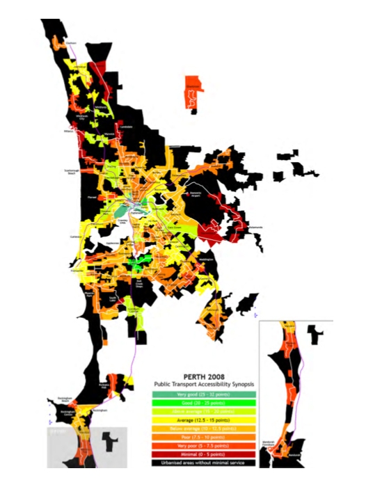
 This map uses the colours of the traffic light to show which areas of Perth have good public transport (green) to average (yellow) to bad (red) to nonexistent (black). If you live in an area in the black and the price of oil goes up too high, as it eventually will, you won’t be able to drive to work because filling up the tank costs more than your weekly budget can deal with. Maybe you’ll try and catch the bus or the train. What if your suburb is badly catered for by public transport? Check the map. Society in your oil-price-vulnerable area will start to fray. To stop a wild west scenario developing we should all keep asking for more apartment buildings and more light rail in sprawling Perth, and faster. In the meantime you can almost see Mad Max saddling up in the distance.
Nice map Jan.